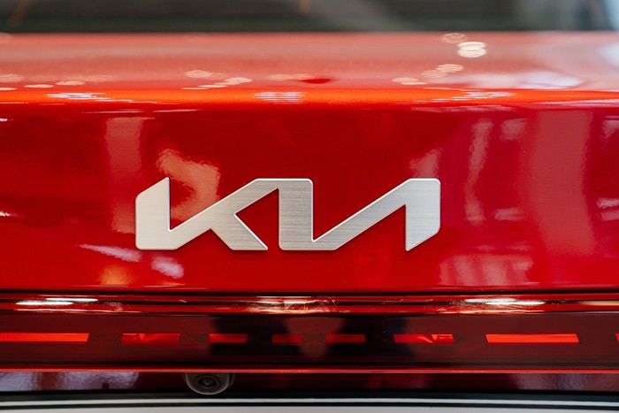
Have you seen the new KIA logo? Did you know it was KIA?
In January of this year the Korean car manufacturer bid goodbye to the red and white oval-encircles logo and said hello to the black and white one. The new logo definitely has a more forward-thinking theme. And that is a good thing since this is what the company is after. MotorTrend posted that KIA changed their logo because they’re changing how they make cars. The company will focus more on producing premium vehicles like the Telluride and Stinger and less on creating budget-friendly models.
What do you see?
Earlier this year KIA said, “The rhythmical, unbroken line of the logo conveys Kia’s commitment to bringing moments of inspiration, while its symmetry demonstrates confidence.” KIA said in a press release. However, the new design has become a major headache to some car enthusiasts and media alike; the logo is hard to read. Yes, it’s spelled as K-I-A, but the way the letters are positioned, some people read it as “K-U” or K with a reversed N. Some Reddit users even thought “KM”, must be a new brand.
Is there a design in the works?
As of this moment, there are no reports on whether the company should stay with the new logo, revert back to the old, or make a new, clearer one. Our guess is that they will stick with it. Both reverting to the old logo and creating a new one can be an expensive route, so sticking to the one they have may just be a wiser decision. But it might just need a rigorous marketing campaign to help buyers get used to it, similar to what General Motors recently did when they spent millions promoting their new logo and electric vehicle vision.
So, What Do You Think Of KIA’s New Logo? Do you or do you not like it? Let us know in the comments section.
Carketa also has a great selection of used KIA vehicles for sale, which include industry leading vehicle condition reports for you to see and download. Check them out by clicking on the link.

Explore related articles to learn more about software solutions for car dealerships:
